Gi hi hi hi!
I know I know, this figure review has long been overdue. But you can still forgive me, right?
Truth is, I already conceptualized the photo shoot for this review while doing the pilot. It was actually magnificent, as I imagine the outcome. But the execution turned out a lot harder than expected, so I had to do it in a much simpler way. And I guess this will be the best format for now, until I get a hold of my time and invest for the proper gears in the future.
Well, enough of the lame excuses. Let’s get started with Tsume-Art’s HQF Gajeel Redfox review, shall we?
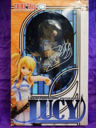
Packaging
There are 2 kinds of figure boxes out there: one with astounding details you will opt to keep it; and one that is pretty meh you will not care at all if it ends up in the bin. And unfortunately, Tsume-Art’s HQF packaging falls in the latter kind.

Unappealing. This is the word that best describes the box containing this badass character. The color choice for the box turned out a bore and lazy, which also applies to the whole HQF Fairy Tail line from Tsume by the way (except for Gray’s blue box, which is another discussion).
In addition, some information about the character is also printed at the side of the box (character name, age, magic, likes and dislikes), which I find lame and irrelevant. It says Gajeel likes old stuff and dislikes hunger, which I have no idea where it came from. Can anyone enlighten me?
At the back features promotional image of the figure as usual. But obviously, the lack of pictures to show it in this review says a lot about how uninterested I am in the packaging. So time to take a look at the figure itself…
Posing
I’ve been reading figure reviews from other blogs in the past and learned that male figures share something in common: they are usually presented in a boring standing pose. And the Iron Dragon Slayer is no exception.

Kurogane Gajeel is shown with his both arms crossed that perfectly matched his smirking face. This pose totally captured the cold side of the Iron Dragon Slayer, as he is not known to be the nicest guy in the series. However, the clothes and pose reminds me of his stint in the Phantom Lord guild rather than Fairy Tail.

But despite the pose, the effort to show dynamism in this figure was executed through his clothes.

The fluttering tail end of his tunic suggests movement by the character, as if Gajeel just flipped his body or landed from a higher ground. This fluttering movements created an illusion of a bigger figure in terms of width, which is also one of the highlights in this figure.

It is admirable that a simple fluttering can make a big change in the total feels of a figure. From a lame standing position, the big fluttering in his clothes complemented perfectly, which I can say became the figure’s center of attraction.
However, Gajeel’s pose could have been a lot grander if he was produced a bit later in the line. Since he is one of the early figures to be released under the HQF line back in 2012, he served as a guinea pig along with Natsu to test the rough waters. I only wish a separate line will be initiated featuring a more dynamic pose for these early releases (version 2 for Natsu, Gajeel and Erza, please!), much like what they did with the recent Gray and Lucy figures.
Paint Job and Details
Tsume-Art, being a greenhorn company back then, initially released Natsu and Gajeel to launch their Fairy Tail HQF line in 2012. Before cashing in on this figure, I remember doing plenty of research as I learned the company producing it is quite new to the industry (that was way back in 2013, when I started my collection). At that time, both figures were already available in the aftermarket, thus reviews for this figure came left and right.
Through those reviews, I learned about some minor mass production issues (paint blemishes in particular) that I might encounter upon buying the item. Fortunately, my Gajeel turned out quite flawless… well, almost.

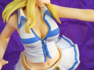
The HQF Gajeel has very impressive details. From the metal studs all over his body, scars on his arms, to the creases and folds in his clothes, I must say he was pretty well made.


However, some minor flaws can still be seen from the finished product. Let’s take for example the paintjob on the crossed arms. From this picture, you will notice a spot where the metal bracelet on his right arm touches the left arm. Notice the metallic paint on the bracelet did not cover the entire accessory, and was partly painted with the skin color.

The feathery part on his clothes could have been better as well if it has a nice feather touch and not as smooth as the final output. Maybe add some feathery details for a softer look?

Also not seen if you look from afar, Gajeel’s hands look weird from a worm’s eye view. His left hand looks terrible, like the thumb was not proportional to the other fingers. It could use a little detail, but since it’ not normally seen from a man’s eye view, they did not bother to add more into it.


Another noticeable thing is that the tail end of his clothing turned out a bit thicker than it’s supposed to be. It gives an unrealistic look to the tunic.

But aside from the minor paintjob issues, the shading on the other parts of the figure looks clean and well done. Well, the details in his tail end tunic actually looks very impressive.


However, it wouldn’t hurt if Tsume pays more attention to trivial QA issues like this one. The rough edges on this part of his clothes is very eye-catching.


There are still a few visible seam lines to improve.

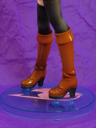
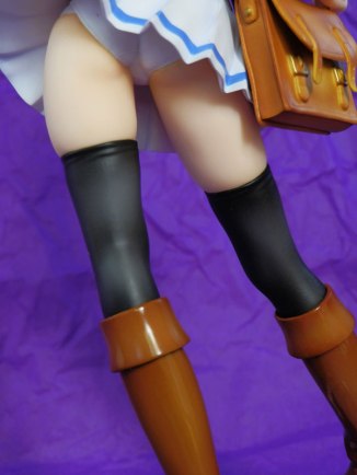
But this figure features a lot of details to make up for the above mentioned QA issues. Like the metallic spikes on his boots, which is a personal favorite. It adds to the definition of Gajeel’s character as the Iron Dragon Slayer.
Still, the company clearly needs to work on the said issues to improve the quality of their works. And to justify the price and exclusivity of this limited figure.
Head Sculpt
And here we go again… Ah, the face.

Gajeel’s face is practically Gajeel, but a little less edgier. He’s face in my observation should be more squarish, and a little contour could have pulled the trick. But aside from this fact, I must admit Tsume-Art did a good job with his face. A lot better than Natsu, which was also released along with Gajeel.

As earlier said, the details on this figure is impressive. The metal studs, earrings, and the detail-rich hair are impressive.

However, I just feel the metal studs on his face should be a little less shiny. The darker metal studs on his arms could have been better on his face. In addition, the metal studs on his nose should only have two on each side. This detail is often mistaken in the anime to have three, so it is quite understandable if it was missed out.


And the hair. Of course, it is not Gajeel without his trademark spiky, slicked back hair. Aside from the fluttering tunic, the Iron Dragon Slayer’s complex hair is also one of the main attractions of this figure.


Dust everywhere! >.<
His flowing hair is gorgeous and cool at the same time. But somehow it kinda looks unnatural. Well, it’s made from PVC so no use in complaining.
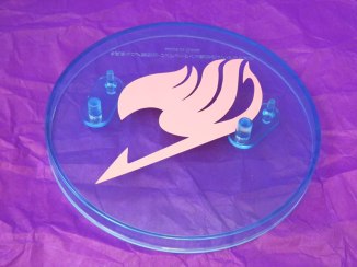
Base
Moving on to another uninteresting part: the base.

Gajeel’s base pretty much sums up what I think sucks about bases: the plain + huge combo.
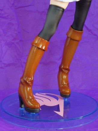
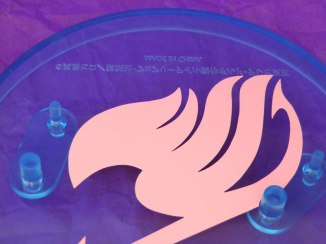
The base is purely made up of plastic, painted black with a silver Fairy Tail mark on the surface. Two pegs jutted up on the surface which holds the figure.


On one side is a plate with a metallic silver paint. Written on it is the name of the character, which reads “Gajil”. I’m not sure but Tsume-Art is pretty consistent with the naming convention, which is different from the original Japanese name or in the English translation. This is kinda annoying for those English subbed fans, but they must be following the French sub (Tsume-Art is a French company based in Luxembourg), thus the spelling.
For what its worth, they could have use a metal plate instead of plastic to justify the exclusivity of the figure.
On another note, I’ve heard mass production issues, like paint blemishes particularly the text on the base. Fortunately mine looks good.

Another thing I noticed is that the base seems huge for the figure. Well, nothing really bad for a huge base, except it consumes too much space when you decide to display it with the figure on your shelf. However, if it is something as plain as this, I will not bother to display it especially if it will not really impress me.
This base design has been the format for the earlier releases of their HQF line, which I find rather too plain and simple to get worked up with. Good thing they stepped up the game and created much more impressive bases lately.
Scale and Price
Gajeel is a 1/8 scale figure available for 79.90 € (or around ¥9800). I believe this is a bit pricey compared to the other scale figures from companies in Japan. And if you live far away from Europe, getting this figure is too much blow to your wallet. If that price made you cursed already, then the shipping fee will add to your worst nightmares.
However if you will ask me, although the price is stiff and getting him is too much of a trouble, it is still worth it. Admit it or not, this could be the only chance to own a Gajeel figure so better grab it while you still can. (Or unless other companies take the license for this series, but I highly doubt seeing him if ever)

Final Thoughts
If you are a fan of the Iron Dragon Slayer, getting this figure is a must because this could be the only decent figure of him you will ever get. This is a sad truth for male characters in the figure community: they do not get much love from companies as much as the ladies, especially if they are stuck being a supporting character. Or unless the anime is too hyped to milk the franchise with, there is a very slim chance we ever get to see one.
Tsume’s take on the character may not be as impressive as the other figures in the HQF line, but if you have a few bucks to spare and a dedicated fan of the series, Gajeel is definitely a great addition to spice up your collection.
***
Ratings
Head Sculpt: 7
Posing: 8
Paintjob and Details: 8
Base: 5
Box: 5
Credit Points: N/A
OVERALL RATING: 6.6
***
Pros: First (and only) Gajeel figure available | Impressive details
Cons: Plain base | Price is stiff for a 1/8 scale | Quite hard to find if you live outside Europe | Mass production issues
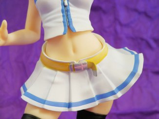
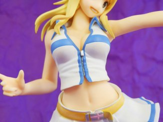
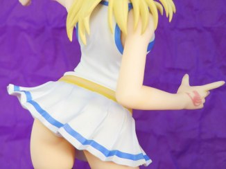
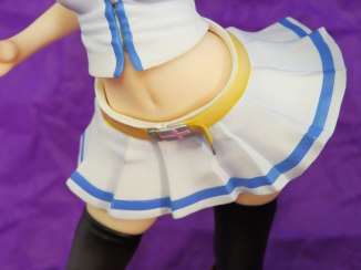
Check out the full gallery below for more photos. (Click on any image to launch a slideshow)